
Monday, June 16, 2014
Saturday, June 14, 2014
Touch-Stones

"Touch-Stones" is definitely a statement necklace and is my latest beaded piece. Even better, it's actually for me, not for sale.
Each of the three pendants is a stone collected on significant journeys in my life: Isle Royale, Montreal and Gloucester.
I used several beading techniques, including twisted tubular herringbone, right-angle weave and peyote stitch.

Thursday, June 5, 2014
GORGEOUS NOTHINGS: The Grave is the Ultimate Seal
.JPG)
I was recently invited to participate in a rather unique exhibit: The Gorgeous Nothings, based on the envelope poems of Emily Dickinson and held at Three Pines Studio in Cross Village, MI.
What's an "envelope poem"?
In the mid-1990s, while examining Dickinson material in the Amherst College Library, the literary historian Marta L. Werner came across a small, irregularly-shaped collage cut from recycled 19th-century envelopes and covered with writing in Dickinson’s unmistakably hieroglyphic script.
Enchanted, Ms. Werner started a search for similar items in other collections and found dozens, long familiar to Dickinson experts but never examined as a group. Most were less elaborate than the collage. Some consisted of semi-intact envelopes that had been gently pried apart at the seams and flattened out. Others were fragments: torn-off corners of envelopes, detached flaps.
Whatever their configurations, the pocket-size papers shared one feature: sentences, stanzas and entire roughed-out poems pencil-written by Dickinson herself.
Now all the known “envelope poems” — 52 — have been gathered into a book called “Emily Dickinson: The Gorgeous Nothings,” published by New Directions and the art dealer Christine Burgin.
My chosen envelope poem was A842:
As there are
Apartments in our
own Minds that-
we never enter
without Apology-
we should respect
the seals of
others -
When I read the poems of Emily Dickinson, it's always through a 19th century filter - I've been involved in mid-19th century living history too long for it to be any other way.
My first inclination was to go in the direction of phrenology, especially the idea of apartments or compartments in the mind.
But I was really intrigued by the idea of envelopes and seals.
Clothing, of course, envelopes the body and I was relatively certain that no one else would use a period correct fan-front dress as the base of their work. Thus, "Emily dressed"!

There is symbolism in every aspect of this piece, some relating to the poem and some relating to Emily and her body of work.
I chose a fan-front dress, as that is the style Emily wears in the only authenticated image of her as an adult, albeit in an earlier style of fan-front. And it had to be in white, of course - it helped that I had a bolt of white lawn in my stash.

Adorning the front of the bodice is a winged death-head, an image from a very old Massachusetts grave stone, reference to death that so often is the focus of Emily's poetry.

Crossed bones, from the same stone, embellish the sleeve jockeys. You can also see the very fat piping I used, black wool yarn in the center. While I love the look it achieved, it was rather hard to force myself to use it - certainly not period correct!

Each flounce is centered with a large, ornate keyhole, a reference to seals. In addition, each flounce was hemmed using a feather stitch, an allusion to "Hope is a thing with feathers".

The top flounce also depicts a mid-19th century image of an apartment building, with people going about their daily routine.

The bottom flounce features a very appropriate quote, from Lydia Child's The Frugal Housewife, a book that Emily's mother was known to have owned:
The piece includes two final embellishments, a pair of chatelaines:

The first is a group of envelopes, translucent, allowing the contents to be glimpsed - an barium page, a bit of lace, some buttons, a tiny silhouette and ripped up printed pages. The envelopes are not addressed - who are the intended recipients?
The second is a trio of large over sized keys, keys allowing the opening of seals.

The other participating artists created equally thought provoking pieces, all on display until June 16th. Will you be in Northern Michigan? If so, do try to work in a visit to Three Pines Studio!
Tuesday, June 3, 2014

Friday, May 23, 2014
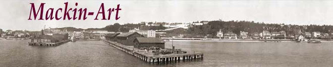
2014 Conference Fabric - Fabric for the Ladies

I always have both a sense of excitement and apprehension when I open up the package- like it or not, it must be made into a garment and worn. I'll admit u front, this is not a fabric I would have chosen for myself, but it has grown on me a bit as time has passed.
The fabric is a fine Italian cotton, with a lovely hand. I felt the colors would have been more typically used on wool or silk in the period, which was confirmed by Carolann when she described the fabric during the "Reveal".
With a fabric this bright and bold, there's only two options: attempt to tone it down or embrace and enhance the color. Most participants went with the tone it down option.
But when I went through my fabric stash and found this perfectly matching length of silk poplin, my choice was made: Embrace it or as a friend described it, "you bear- hugged it into submission".


It wasn't clear in the fashion plate if the jacket was a true jacket or trim applied to look like a jacket. I decided to go with a true jacket, to give a little more versatility.

I used a fashion plate (the lady on the left) and a sleeve detail from an original garment as inspiration.
My approach with the fashion plate was not to create a duplicate, but instead to interpret the details into my garment; I believe this is more the way fashion plates were used at the time, as opposed to being literally copied.
I did not have fabric to create the double skirt, but did have enough to place trim with the same dagged shape - I did not have this done for conference but added it later.
The bodice has a slightly pointed front and is trimmed with fancy buttons. I'll be posting more about the buttons in a subsequent post.
The sleeves are bishop style, with a twist - ending in points and brought back together at the cuff. The require a full undersleeve to hang properly, in this case, made of black spotted netting. Yes,I combined plaid and polka dots.
It wasn't clear in the fashion plate if the jacket was a true jacket or trim applied to look like a jacket. I decided to go with a true jacket, to give a little more versatility.
So there it is, the "diamond dress" - I'll be wearing it at Greenfield Village this weekend, see you there!
Sunday, May 18, 2014
.JPG)
Tuesday, May 13, 2014
Places of Mackinac Exhibit

I'm very pleased to have had a piece accepted into the 2014 "Places of Mackinac" art exhibit at the Richard and Jane Manoogian Mackinac Art Museum... and a photograph no less, the first time I've had a photo on public exhibit.
My photo is entitled "Winter Blues" and depicts foot thick slabs of ice, piled on the shore of the Island. This ice is bright blue and glows against the gloomy grey sky, absorbing and reflecting every bit of ambient light.
How is this a "place" of Mackinac?
Well, every island is ultimately defined by water and for the year round residents of Mackinac, winter's ice and it's impact on our lives, is most certainly a "place"!
If you're visiting Mackinac Island this summer, do try and make time to visit our art museum - the permanent collection is fabulous and the seasonal, juried exhibit is always a pleasure too!
Subscribe to:
Posts (Atom)
